
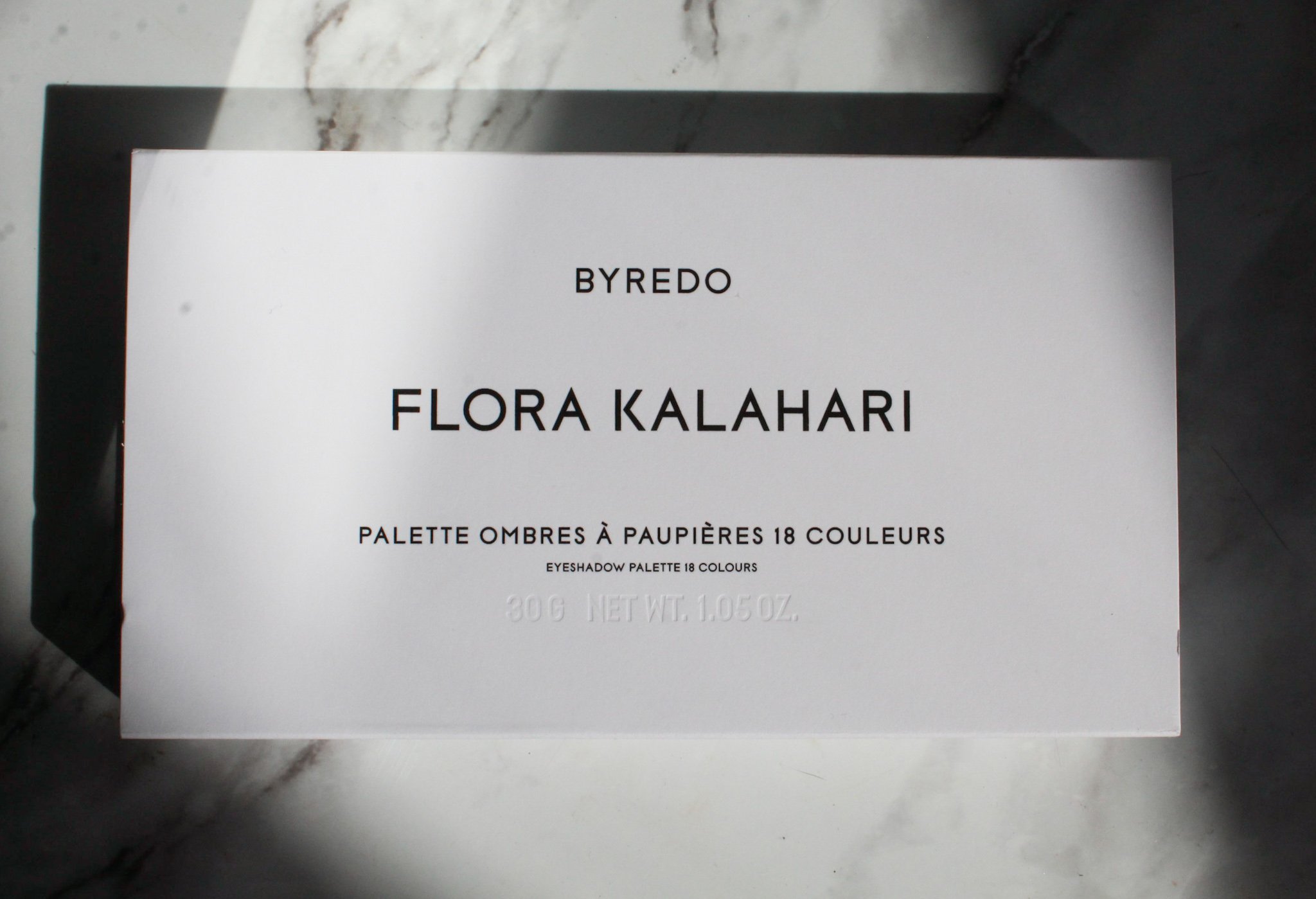
A new palette that wasn’t even on my radar has made its way into my hands – the new Byredo Flora Kalahari Palette.
This is a stunning new palette from Byredo in a large palette format with 18 shades and retails for $96. It officially launched on March 1st, though I am still seeing it trickling onto online shops. Currently, it is sold at Byredo and on Bergdorf Goodman’s website. It is sold out at Saks and Bloomingdales, though I bought mine in person at Bergdorfs and expect it to be online there as well.
This is not the first large palette the brand has released- they released the Prismic Palette last year that had much brighter shades, but this one is much more wearable with more neutral shades.
I actually haven’t really kept up with Byredo makeup – their products are absolutely stunning, without a doubt, but the shades haven’t really stood out to me. As I’m sure many of you already know, the line was designed in collaboration with Isamaya Ffrench, a brilliant makeup artist who does beautiful editorial looks. The Byredo makeup launch was highly anticipated, but as for me, someone who veers heavily into the side of natural looks, soft colors, and neutral shades, the line didn’t totally align with my everyday makeup style.
That is, until this palette caught my eye.
Why am I so excited by this? I haven’t felt this kind of excitement around something I know so little about. I literally had no idea this palette was coming out and it was a chance encounter when I decided to wander into Bergdorfs on a walk, and the associate pulled this out from behind the counter as it hadn’t officially launched yet. I generally thoroughly research my purchases to avoid impulse purchases I’ll regret later but since I haven’t kept up with news about Byredo, I hadn’t seen this release yet. As soon as I saw it, I knew it would be hard to pass up. It has a mix of neutral and colors, with majority neutrals in the tones I reach for the most.
There is something about this palette that excites me in a way I haven’t about makeup in a long time. Maybe it’s total impulse purchase and excitement of seeing something completely new that I hadn’t researched to death already, but I am generally not excited by palettes these days. As I wear mostly neutral shades and own so many neutral palettes already, there’s only so many takes on a neutral palette I can look at before I start getting bored, but this has visual and textural interest while still falling squarely into the type of makeup I typically wear.
So, as I’m sure you can tell by now, I have an extremely positive outlook about this palette just on looks alone. Onto the specifics, it comes in a large chrome case with floral detail on the cover. The chrome packaging is my favorite kind of packaging, even if it is extremely prone to fingerprints. I’ve gone on in previous posts about how I prefer silver details – silver hardware on clothing and accessories, silver jewelry, silver packaging, etc – so this was already eye catching before I even saw the inside.
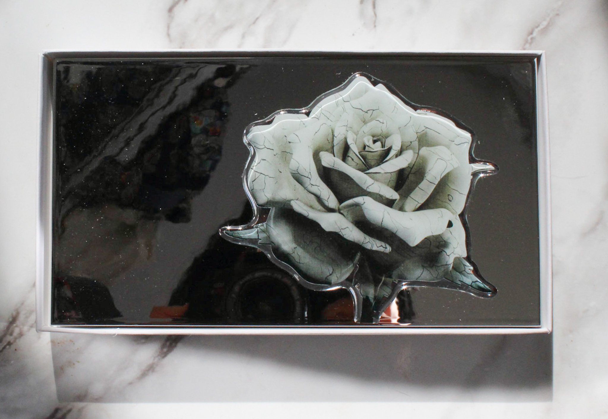
On the inside, I also love that the pans fill up the entire palette, and there is no wasted space. The eyeshadows themselves have a variety of finishes, from satin matte to shimmer to glittery, with a mix of cool and warm undertones. The photos absolutely do not do this justice at all – if I had seen this palette online first, I wouldn’t have even bothered to buy it, if I’m honest. But in person, the nuances of each shade really shine.


The price point of this palette also feels right to me. While $96 is definitely a high price point, their 5-pan palettes are $70 for .2oz/5.66 g of product, and this palette has 1oz/30g of product – so you’re getting almost 6x the amount of product for $26 more. While the packaging of the 5-pans is also ornate, I find the packaging of the Flora Kalahari to be equally as luxurious.
The feel of the shades themselves is creamy, soft, and silky. None of the shades feel dry, and they all blend effortlessly. The formula is designed to be used easily with fingers, and I find that the formulas are creamy and pigmented enough to do that – though I always use a mix of brushes and fingers. Byredo currently doesn’t have any brushes – though I also heard they will be coming out soon.
The formula of these shadows is hard to compare – they are soft yet pigmented and buildable. I haven’t tried the other Byredo 5-pan palettes so I don’t have that reference point. They aren’t pigmented like Natasha Denona or Pat McGrath shadows, which have opaque pigmentation and dramatic glitter, and feel like a thicker formula because of its pigmentation. The glitter shades are especially beautiful – they are what I wanted the Pat McGrath glitter shades to be, as they have a super pretty sparkling finish, but feel smooth to the touch, as opposed to slightly dry and chunky, which I feel Pat McGrath’s glitter shades to feel sometimes.
The formula of all the shadows are generally softer pressed than Tom Ford or Charlotte Tilbury shadows. They almost remind me of many Korean and Japanese palettes in their lightweight finishes, but as soft and lightly as they are, they aren’t dusty or powdery. More importantly, they are long-lasting on my oily eyelids. I always wear eyeshadow with a primer otherwise no shadow lasts more than a couple hours on me, but these wore for 12 hours with no fading at all and very minimal creasing (and even with primer, most shadows start to create at 7-8 hours).
While the shades in this palette seem randomly arranged, I find it easiest to look at shade combinations by rows, I’ve been skipping around shades, but it is helpful at times to have some type of color combinations to follow.
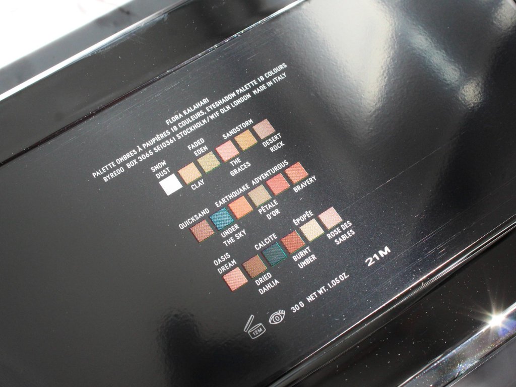
First row:
- Snow Dust – glittery shimmer white
- Clay – satin matte camel tan
- Faded Eden – frosty shimmer khaki green
- The Graces – frosty shimmer pinky coral with gold shimmer
- Sandstorm – frosty shimmer peachy bronze
- Desert Rock – satin matte cool toned tan/taupe
(click on the photo to view them larger!)


Second row
- Quicksand – glittery shimmer light neutral bronze with a hint of pink shift
- Under the Sky – blackened teal with blue glitter
- Earthquake – satin matte bright orange
- Petale D’or – glittery shimmer
- Adventurous – frosty shimmer ruby red
- Bravery – glittery shimmer pink with gold shift


Third Row
- Oasis Dream – frosty shimmer light pink with gold shimmer
- Dried Dahlia – glittery shimmer bronze
- Calcite – black with purple and pink glitter
- Burnt Umber – satin matte deep brown
- Epopee – glittery shimmer sheer pink with gold shift (much lighter and more translucent than Bravery)
- Rose Des Sables – glittery shimmer sheer pink base with multi-chrome green-pink shift


Although some of these descriptions sound similar, I find the nuances in tones to be much more nuanced when I apply them on my eyes. The two bronze shades, Quicksand and Dried Dahlia, have different depths, which makes them distinct to me. The 3 shades in the bottom right corner also look somewhat similar in the pan, but the swatches show that they have different glitter tones and shifts in color in the light.
I also created a reel to show how the shades look under the light. I find that this is where the colors really shine!
I also applied some of the shades in this reel here:
Overall, I am enjoying every bit of this palette. It fits seamlessly into my makeup rotation, and gives me a few shades to play with when I want to experiment without overwhelming me with color. The whole palette, from the packaging to the concept to the formula is a hit for me. The experience of seeing this palette in person completely unexpectedly also makes this feel like a wonderful surprise – and wonderment and surprise are not frequent feelings I have about makeup these days. If you are a neutral makeup lover who also loves unique packaging, this is a palette I recommend checking out!

Leave a comment