
Byredo is launched another one of their 18-pan palettes again, and this year’s version is the Remembrance palette. I reviewed last year’s Flora Kalahari palette, which I instantly fell in love with, and then loved even more the more I used it so I knew I had to get this year’s version.
The palette doesn’t officially launch until April 13, but it launched on the Bergdorf Goodman website early, and promptly sold out. The best bet now may be to wait until it launches on Byredo’s website.
It retails for $105 for 18 pans, and while it is by no means an affordable palette, it is more value for your money than their 5 pan palettes, which retail for $75.


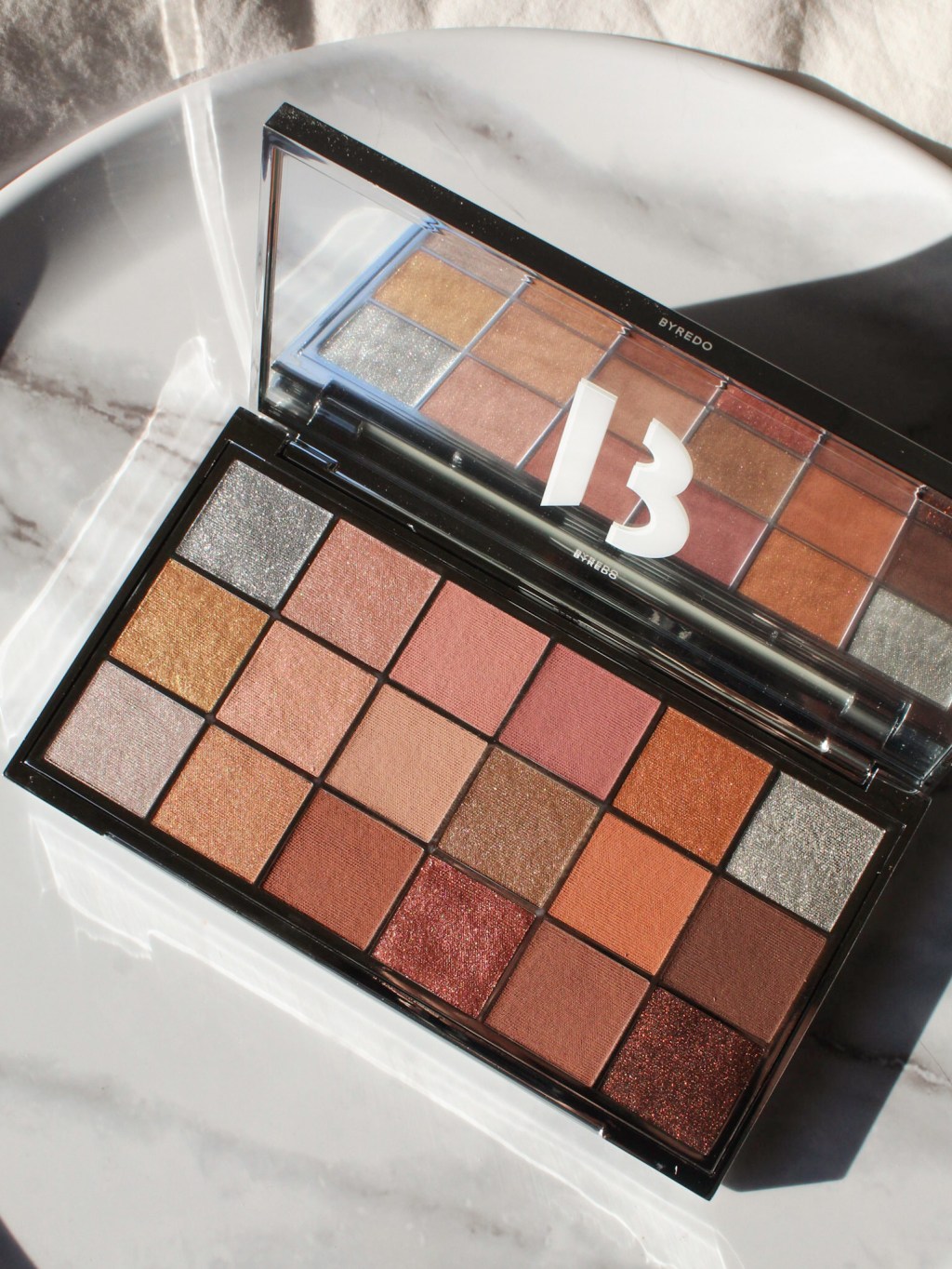
The Remembrance palette is a neutral palette with a range of metallic, shimmer, and matte rosy and coppery neutrals. Although neutral palettes are not unique, this one does have a nice mix of cool and warm tones – and like last year’s Flora Kalahari palette, the range of finishes makes this a versatile palette.
This palette comes in a similar chrome packaging to Flora Kalahari, which is beautiful, though it definitely will get dirty easily. I use Flora Kalahari regularly enough and at this point it’s difficult for me to really get rid of all the fingerprints. It doesn’t bother me because I love using these palettes, but just know that the outer packaging will not stay pristine if you’re using it regularly.

The formula of these eyeshadows is also different from standard formulas, especially ones that I find in the Western market. They have a very soft and silky formula that are pigmented, but not completely opaque. They have a soft sheer translucence to them, which reminds me of many Japanese formulas. Surratt Beauty also has a soft and silky formula like these. I find that this type of soft texture gives the shadows a really beautiful ethereal and glowing look, and they blend exceptionally well.
I love the rose and copper shades in this palette – they feel fresh and don’t pull too pink or too copper on me. I know, I just said this about the Tom Ford Forbidden Pink quad – I have a theme this season!
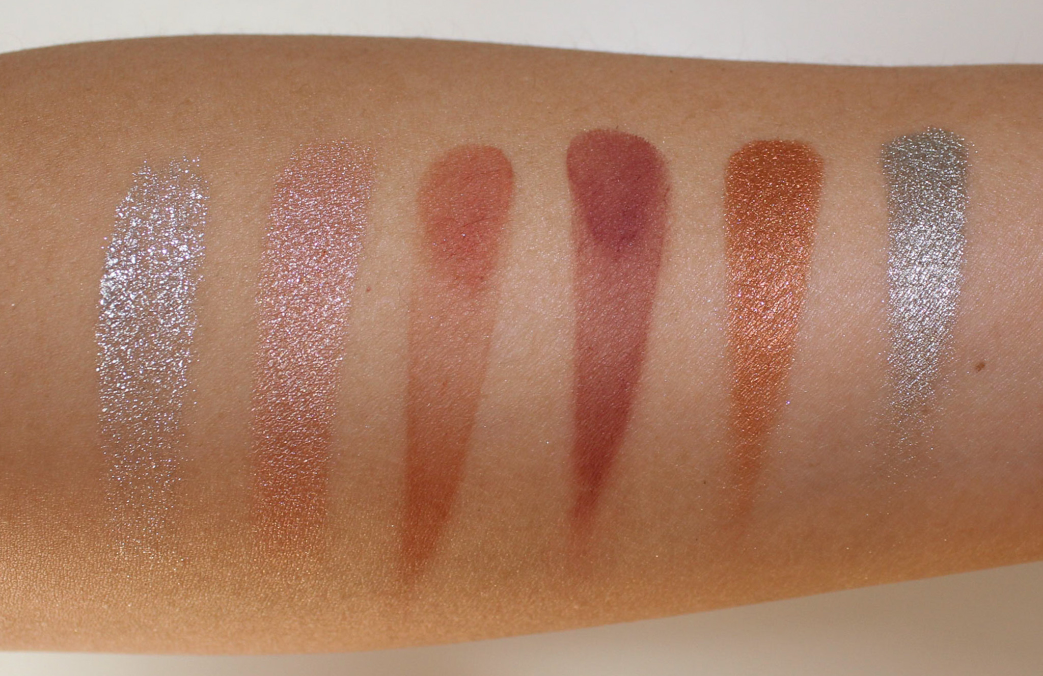
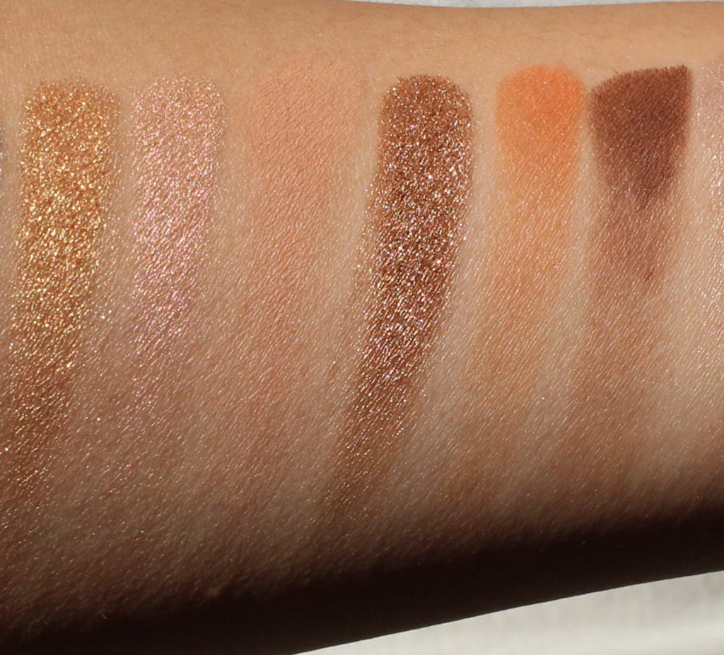
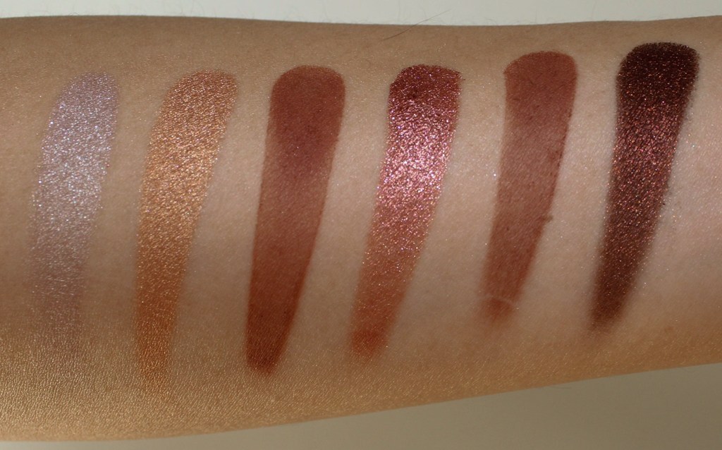
I swatched each shade by row. This time, the shades are only numbered instead of named:
ROW 1:
- Glittery silver
- Shimmery cool pink-champage with light glitter
- Satin-matte mid-tone sienna brown
- Satin-matte mauve
- Shimmery copper
- Shimmery silver gunmetal (deeper and less glittery than shade 1)

ROW 2:
- Shimmery gold
- Shimmery cool icy pink with a gold reflect
- Satin matte beige
- Shimmery brown taupe with light glitter
- Satin matte mid-tone prange brown
- Satin matte deep warm brown

ROW 3
- Shimmery oyster gray
- Shimmery gold-copper
- Satin matte terracotta brown
- Glittery red-copper brown
- Satin matte neutral brown
- Shimmery deep brown with gold shimmer

The eyeshadows really come to life in person, and this reel gives you an idea of how this shimmers and glitters look:
When I shared this palette on Instagram, I got a couple questions about whether there are any similarities with last year’s palette. I did some comparison swatches, and while I saw a few similar shades, I only saw one shade that might be an overlap between both palettes.
I coded each shade in each palette by row (3 rows starting from the top) and column (starting from the left). So the top left corner shade would be shade A1, the shade directly to the right would be shade A2, and the most bottom right would be shade C6. An R in the front (i.e. RA2)indicates the Remembrance palette while FK indicates Flora Kalahari from last year (i.e. shade FKA2)

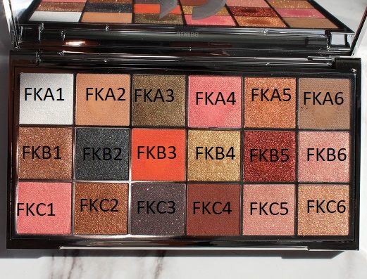
- RA2 and RB2 vs FKC5 – the Remembrance RA2 shade is less shimmery and cooler than FKC5, while RB2 is less shimmery and has a bit more peachy beige tones
- RA5 vs RA5 – these 2 coppery bronze shades are the only shades that I think are overlaps
- RB1 vs FKB4 – RB1 is a brighter gold with gold shimmer while FKB4 has silver glitter


- RB3 vs FKA6 – RB3 is lighter and pinker while FKA6 is a gray-brown
- RC2 vs FKC2 – RC2 is a more of a bit cooler and lighter
- RC3 and RC5 vs FKC4 – RC3 has more orange tones compared to FKC4, and RC5 has more rose tones
- RC6 vs FKB5 – the Remembrance version is more of a blackened red, while FKB5 version is a brighter red


I will be working on more looks with this but here is one that I’ve already created. I’m also wearing the Byredo lipstick in Earth Dust to complement the look.

Overall, this palette is just what I wanted it to be and it’s even prettier in person than it looked online. I already knew from last year’s palette that the formula is fantastic, and I find the palette super wearable. It’s a great spring palette with its neutral rose and copper tones – if these are your kind of shades, I’d definitely recommend keeping an eye on this on the April 13 release date.
Thanks for reading!
Leave a comment